The music is great, but that’s it. – Mind Symphony Review
The music choice is top notch, but that’s about it for this game. The rest is all about the poor user experience.
If you look from a 3rd person point of view, the background animation during the battle is cool and artistic. But from the view of the person who is playing it, you will find it’s way too overwhelming. The theme color of the background is red, most of the enemies are red, their bullets or laser are also red. It’s so hard to identify them during a intense fight. Only after one game, my eyes feel hurt.
The clam mode is pretty clam, but way too simple. The dots and background star falls are not connected to the rhythm of the music, the song feels too long compares the “tap one button” gameplay. After 2 songs, I feel more boring than calm.
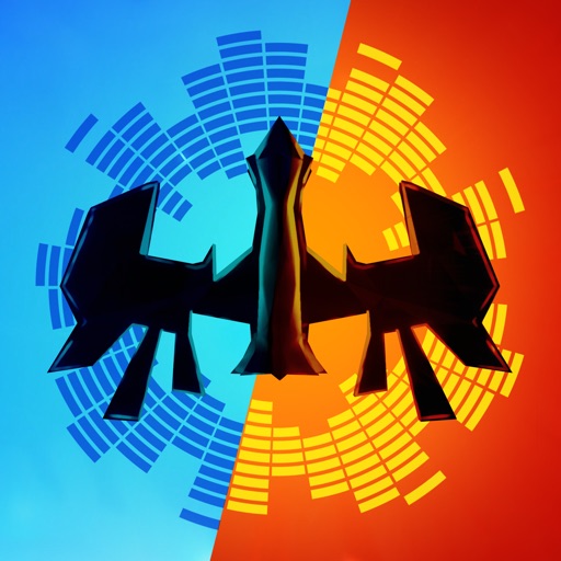
Even the main menu is confusing. I can understand, the creator of the game wants players to choose from 2 modes. But the button which is not been selected looks like it is disabled. The layout of the background is left and right, but the button layout is up and down, which is also conflicting with each other.
I love the idea of connecting space shooting and awesome music. But it is not as simple as just mixed them together. It needs more work to make the game feeling decent. Apparently, there’s still a long way to go for this game.
Review by MurcielagoZhou on Mind Symphony.
Review by MurcielagoZhou on Mind Symphony.