DON'T LIKE UPDATE CHANGES – BibleScope Review
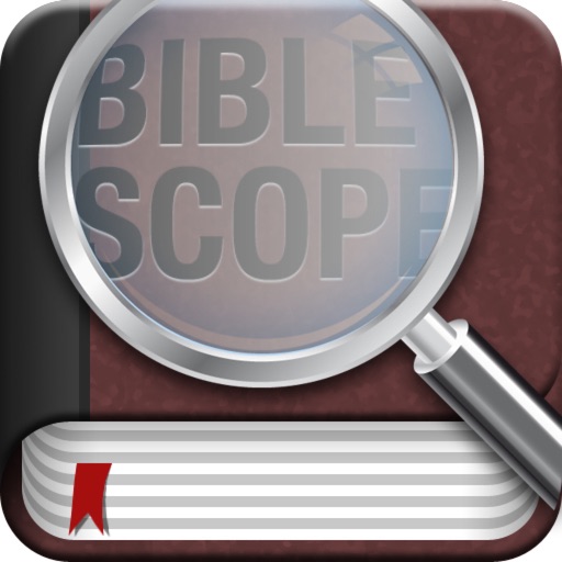
1. You need to put the CROSS back om the Bible icon. I want people that look at my phone to recognize my Bible and the CROSS straight out.; right out on the front...except now it isn't there anymore!
2. The Strong's references aren't highlighted any more, making them harder to tell if the word you touch is even available without reading to see if it matches the word or not.
3. The Chapter Catelog keeps defaulting to the new way of selecting, which I DON'T LIKE, and won't stay the way I put it. (The old way).
I still like the app, but now it is starting to frustrate me because you have taken away some of the things I like and use.
I had NO issues with the program until they forced these changes in the update. PLEASE PUT IT BACK, or at least give me the option of keeping them the way I want them, by default.
Review by Country Dave' on BibleScope.
Review by Country Dave' on BibleScope.
