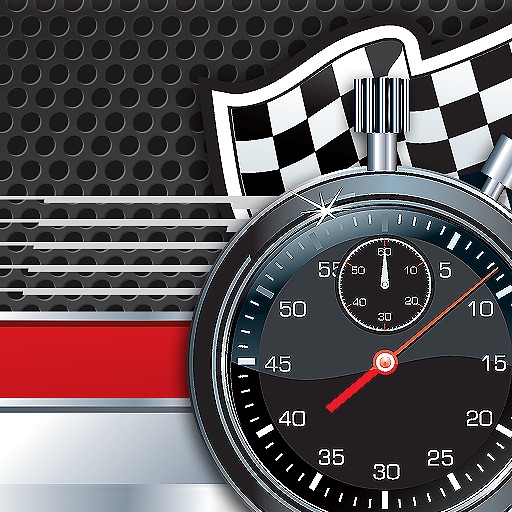
Ugly – Racing Lap Timer HD Review
Fonts scar your eye due to not cute attempt to mock a digital display from 30 years ago. Inconsistent letterform width means that width of lines CONSTANTLY vary, resulting in mania.
Review by Chiefhiawatha on Racing Lap Timer HD.
Review by Chiefhiawatha on Racing Lap Timer HD.