Current version is less "minimal" – Minimal Sudoku Review
I have loved this app for several months. Gave it 5 stars on my original review. The current version introduces several poor changes, in my opinion.
- GameCenter. I dislike GameCenter. I find it intrusive. I don't play sudoku to compare myself to other players, I do it to stretch my mind and relax. Having a GameCenter notification pop up disrupts the minimalistic feel of this otherwise good app.
- I dislike the new larger rounded number buttons. They feel somewhat childish to me, and the proportions of the numbers to the circles do not match up well.
- When the game is finished, the animations and screen changes move too fast. Again, disrupting the zen minimalism of the app.
- The prompt to change levels is no longer nicely centered in the middle of the screen, it is in the lower left corner, disrupting the beautiful symmetry the app used to have.
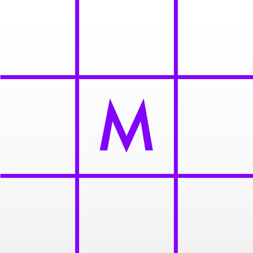
- I dislike the new icon. Bright purple lines and lettering? Too bright, too attention-grabbing. Prior icon was more "minimal".
Overall, this still remains a very nice sudoku app. Gameplay works wonderfully. Layout is strong. But what was an outstanding app is now merely a good app with the design changes involved in the new version. Thankfully I still had the old version saved on my computer and I have "downgraded" back to the old version.
Review by Sachsen on Minimal Sudoku.
Review by Sachsen on Minimal Sudoku.