Grocery/Shopping List Pro
| Category | Price | Seller | Device |
|---|---|---|---|
| Food & Drink | $4.99 | Rojao Inc | iPhone, iPad, iPod |


There is also the ability to share your lists via text, email or messenger app with the touch of a button. Keep family members in the loop and share easily with everyone.
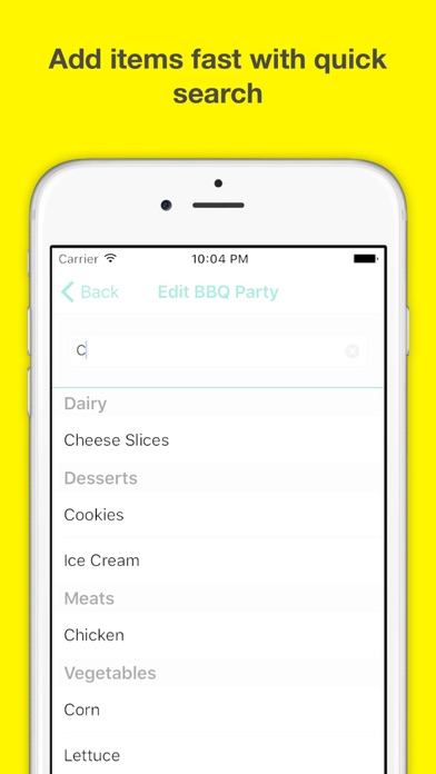
Beautifully designed and made for quick access. Perfect for grocery or shopping lists, ensures that you will never miss an item on your shopping list again.
Saves you:
* Time: a well-planned list updated in real time saves precious minutes and hours in a store.
* Money: when you know what to buy you're safe from spontaneous purchases and waste.
* Zen - you will be happier without the frustration caused by double purchases or forgotten items
* Environment: paper shopping lists are made of trees. Our list is made of code which is environmentally friendly.
Bring your shopping list to the next level and make shopping a whole lot easier. Shopping
How much is your time worth? Save money, time and energy with the Shopping List Pro app.
Reviews
Can’t write in items
eLizzie33
Apparently you have to be a shopper with very specific items on your list for this app to be useful.
Too difficult to navigate
Wilsotele
There are far too many steps. I'd just like to add an item to my shopping list. I don't need to name the list or categorize the items on the list.
Get today!!!
lava(nder) lamp ?
The app is free for today and straightforward no hidden fees or anything does its job and lets you get on with your life I highly recommend if you are reading this today, it is free just for today.
Not usable
ActualConsumer
App takes too many steps to create a list... and that too can only select predefined items. So if you are the type of person who only shops for the items in the predefined list, and does not mind the clumsy interface, then this is the app for you.
Limitations
dunsboro colonial
There does not seem to be a way to add custom items to your shopping list. You have to select from a predetermined list of items. If the item you want to add to your shopping list is not in the list of predetermined items, then you are just out of luck.
Not sure why there are negative reviews?
Jerry Lucianovic
I’m very surprised that there are negative reviews on this app. I downloaded this and switching from another similar app, I’m not looking back. The reviewers are incorrect in what they’re saying, perhaps they’re just not taking the time to understand how to do what they’re trying to do. It has a simple uncomplicated interface and does what it should. Want to add categories, no problem. Want to add items, no problem. Want to edit the preloaded lists, no problem. I even ran into a small snag with customization, sent an email with the situation and it was fixed in two days! Very responsive developer! Two days! I love the app, please try it before listening to the negative reviews. ?
Comparing good & bad reviews
Somps
In my reviews, I take several things into consideration. The apps intuitive use, its ability to get the job done, it’s appeal, and the responsiveness of the developer. I’ve come across great apps that aren’t kept up or the dev doesn’t respond to the users, so this is very important to rating the app. I’ve seen good reviews and bad reviews for this app and I think I understand why. It’s strong and useful, but I can see that for some users, this app may not feel like it has what it needs, but that’s because the user doesn’t understand the workflow. I’m going to take a guess that many of the bad reviews are from people who are used to Microsoft’s “Apply” & “Ok” system where many Apple users are used to not needing these confirmations. If you are used to both systems, you can understand what I mean and you might also see the small gap. I’ve used a shopping list app that covered this gap, but it wasn’t kept up after ios9. Otherwise, this app has a lot of things that some users aren’t seeing. To the developer: On the iPhone, I put in KozyShack Cinnamon Raisin Pudding and applied it to the “Snack” category. When I put it in my list, I set the number at “6”, but when reviewing my list, I couldn’t see how many I needed to buy because the name is long and doesn’t allow room whereas the iPad is wider and does show the number. I think if you either truncate the name or carry over the “How Many” to the next line would help. I don’t want to change the name as that brand has several items with a similar name and if I give the list to my wife, she needs to be able to see the exact name. The other thing for the dev is that one of the reasons there are some bad reviews is because a few of the pages look so similar that the users think they are in the same place and don’t realize that there are different options other than what they saw on the similar looking page so they assume that the function isn’t there.m and they don’t realize that all they need to do is tap the back button and it’s set. Others may be able to notice the difference and know what to do. My solution would be to make something specific for whatever page you are on so that the users have a clear visual of the separate functional pages. It seems over simplistic, but I really think that it would change a lot of those bad reviews into good reviews. Years ago, my company bought a $30,000 software package to run some very important hardware. One of the problems was that the users always thought they were in the same place because the developers didn’t see the need to title the different windows, which all looked the same. From their point of view, they developed the package and were very familiar with exactly where they were at after clicking on one thing or the other, but what they weren’t realizing was that the users were completely new and coming to it with visions of other software in mind, so they didn’t know exactly how it worked and felt lost very easily. It took me a while to convince them to just title each window which was easy enough to do and made things more clear for the users. They didn’t want to, but after reminding them that we just put out $30,000 for them to customize it to fit our needs, they finally saw the light. I understand this is long, but if you would like my input on how to bridge that gap so that some of those users don’t need to post bad reviews, let me know the best way to contact you. I’ve got some ideas that might be an easy fix.
Works well
Rapperbs
Once you understand how to work app, its easy to add your own items. I currently use notepad for my grocery list and have sometimes deleted too much when deleting items I have picked up. This app fixes that.