
Burst for reddit
| Category | Price | Seller | Device |
|---|---|---|---|
| News | Free | Alex Duckmanton | iPhone, iPad, iPod |
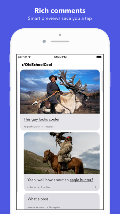


For everything in your feed, Burst finds reposts all over reddit and intelligently merges the comments together. This helps you see things from other perspectives to foster a more open mindset.
If a link in your feed is reposted across r/apple, r/iphone, r/technology and r/android, Burst merges them all into a single discussion. Links posted to r/politics, r/conservative, and r/liberal are combined to help break down filter bubbles you might be stuck in.
Reviews
Love it!
ImAltastic
I’ve tried almost every Reddit client on the App Store. I keep going back to the official Reddit app because it has everything I need and for now this app is still a work in progress. I’ve noticed little animation glitches when swiping between comments and I hope a compose button will be added so I can send messages to other Reddit users on here. That along with message notifications would make me delete the official app once and for all. Great start! Keep up the good work!
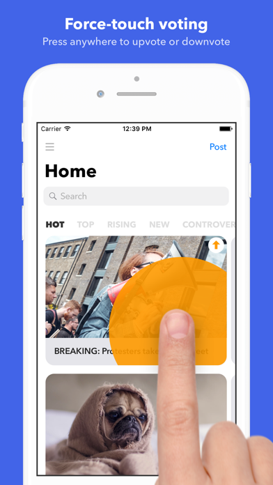
Good idea, force touch is non existent
TheBensonBoy
Although I like the app as an idea, there is a big force touch bug that is infuriating to use especially Because that's how your supposed to use the app anyway. When opening the app for the first time, there is a fake subreddit, or is very hard to find, telling you how to use the app. It's just simply not a good client Note, I do have an X and I have seen a couple other apps not be able to do 3D touch inside, so it may be an iOS bug, but other apps allow me to 3D touch so I highly doubt it. Please fix this, I would love to post an unbiased review at one point
The app would be perfect if there was a setting to view an entire comment section
Inderjeet 23
I know the entire point of the app is to burst the bubble, but I would love for there to be an option to change the way comments are view to the traditional way; burst is by far the best looking client and I would love to make it my daily driver, but the comment viewing is too tedious. Great app otherwise!
Ambitious idea that has room for small improvements
Aleks Alhambra
This is a huge idea that connects with Project Xanadu - a single link/article now connects all comments into a minimalist visualization. This may even push future ideas of comment aggregation - imagine YouTube and Reddit and Ycombinator all in one (though that could lead to the Facebook-ization of comments and not just social media profiles. Some issues: - I don’t exactly know how to open the actual link/article! I need a visual tutorial for that. (Found it was to just tap - whoops) - If there are several subreddits of comments, I wish I could access a table of contents to quickly go to one subreddit or the other - perhaps when the subscribed subreddit’s comments end? - Can’t copy and paste text of comments or subreddit info. - hide Remove Ads / Change to “donate” when someone has paid. - Multireddits of course!
Great!
Helloimant
This app is wonderful for browsing Reddit. It looks nice, and it gives a unique perspective to every post. While it could be better, such as swiping to the side for comments is a bit too sensitive, i’m very excited to switch from the default Reddit app.
Suggestion to Dev
General Jim Raynor
Tbh, from my own opinion, the futuristic layout is a fundamental flaw to the app. It spend much more time just to scroll down the comments section like other clients, Apollo, Reddit, etc. Since Reddit is driven by content. If an app try to be competitive than others by only differentiating layout, reading experience must be compensated. While THIS, I could say, hurt the user experience a lot On the other hand, Dev should check out every competitor. From the app what I tried before, they basically use the same layout with official one
Some improvements
DasMeowHaus
I really like the idea, but I find it a little hard to use the app due to the minimal style, esp. when I want to see upvote count or which subreddit a post is in. It would be great to bring the info like OP's username, subreddit, upvote count, and time since posted from the swipe over to the front of the card. I think it could be doable without sacrificing the minimalism, and it would save time.