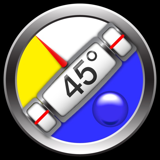
Hideous Icon =( -still ugly!!!! – Clinometer + bubble level Review
The new clinometer icon does not say iPhone. I used to put it with all my other navigation and Geo icons, now I've hidden the new Frankenstein icon in a folder.
I wish company's would just understand this one basic principle: Apple fans love apple for their design. The company's that do well in reproducing their own programs following the example of Apple are the ones Apple users are more likely to go for, it starts with the Icon, that's the first thing a 'app store browsing client' looks at, and that is how a company represents their first impression. And now you've ruined it.
Review by ?ㄗ丹れ刀丹 on Clinometer + bubble level.
Review by ?ㄗ丹れ刀丹 on Clinometer + bubble level.
