New Update Looks Awful – Karta GPS - Offline Maps Nav Review
The previous version 2.13.02 looked great. The map was clean, the colors were unique and easy to understand. I preferred it to Google Maps.
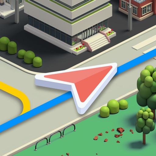
The new update 2.15.04 ruins the looks of the app. The colors are boring - a bland gray instead of a cream color for urban areas. The highlighted road now has a white outline that looks ugly. The text is now displayed on the road instead of above it, so you're forced to read verticals text which isn't easy to do whole driving, and it makes the app look unclean. The font itself is just ugly.
Everything you changed, you made worse. I've downgraded to 2.13.02 and I don't plan on upgrading if you're going to stick with this new awful design.
Review by Aniphone5suser on Karta GPS - Offline Maps Nav.
Review by Aniphone5suser on Karta GPS - Offline Maps Nav.