Seems OK, but... – MKSensation Review
Kudos to the developer for bringing these sounds to iOS. But why is the main "window display" CROOKED and skewed?! And why are there white lines (of different thicknesses) on three sides of the display? And why is there a shadow on one edge of the display?
Even the text — "Live Giggin' Module" — is crooked, off-center, and sags on the left.
How on earth do those things even happen?! And how does a developer not notice before releasing a product?! The UI on this app is a jumbled, nonsensical mess.
Also, the contrast button seems to be non-functioning. Tapping it only nags the user about purchasing more sounds. So, why include the contrast button at all? It's as if the entire, center section is some weird attempt to mimic the MKS-20's front panel. But why make it CROOKED? Why add the weird, white lines? And why include buttons that have NO FUNCTION?
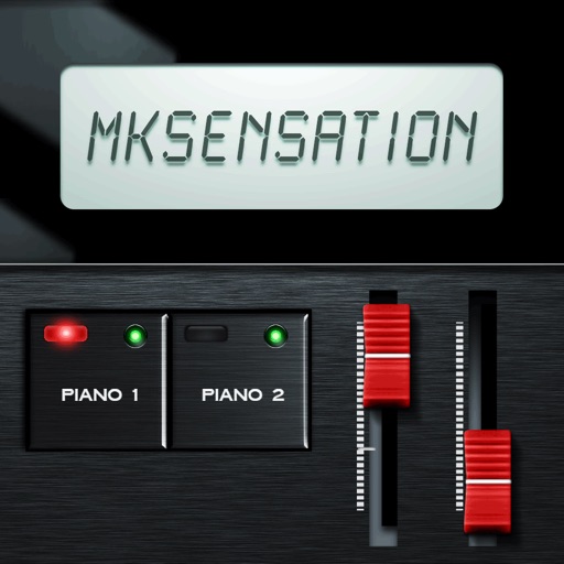
Also, the mixer channels are far too close together. And there's no apparent way to zero a channel (or channels) after accidentally moving it (them).
It's nice to have the MKS-20 sounds on iOS, but this app's UI is downright hideous—for no good reason.
Review by behind the mask on MKSensation.
Review by behind the mask on MKSensation.