Time Princess: Dreamtopia Reviews – Page 3
5/5 rating based on 50 reviews. Read all reviews for Time Princess: Dreamtopia for iPhone.
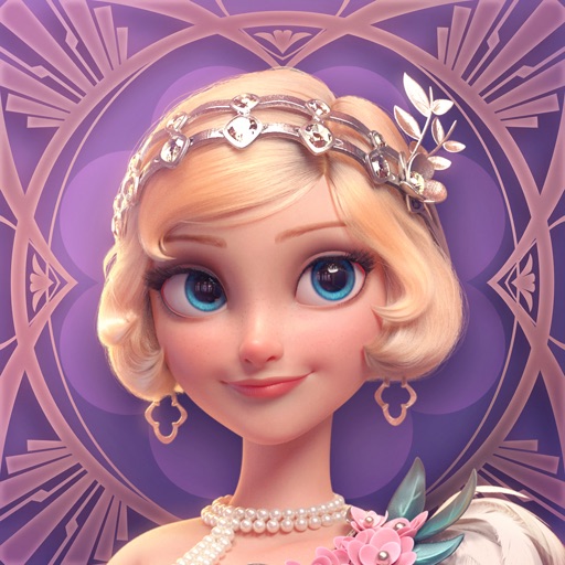
Time Princess: Dreamtopia is free iOS app published by IGG SINGAPORE PTE. LTD.
New UI is unusable
deddinty
I have a ton of time and not a little money in this game. I enjoy the dress up and stories. However, the tiny fonts and extremely low contrast in the new UI changes, especially the filters, have made this game unplayable. I literally can’t read the story titles, and I’m not alone. Please try to consider people’s needs when redesigning your UI every other month. At least use accessibility standards such as keeping lists in alphabetical order for those with disabilities.
Becoming unplayable
Persephone8020465
Look they’ve had some weird missteps lately with story choices, but I overlooked it. Also overlooked their blatant favoritism to listening to the Chinese servers concerns over ours. What has made this game near unplayable however is their decision after this last update to continue changing the UI to make the icons a fraction of the size they used to be on top of changing the color scheme to the most unreadable, ugly choices possible. People say they’re trying to make it look like the game “shining Nikki”. I think all it accomplishes is destroying the accessibility of this game. If they don’t want to listen to feedback on this, I’d rather whale another game. If you’re torn between this and shining Nikki, you might as well check that out instead since they wanna act like they’re a copycat of it instead of their own game.
At it again
Amararose
Every so often, this game reminds me of why I hate it. It’ll be good for a while then they start cheating you again. This time it’s with the fantasy fair payout. Instead of 500 coins, I’m only getting 50. Asked about it. They said they would research it and get back to me in two days. Waited 5 days. Nothing. Then they say they need another day and don’t care if I leave the game. They have enough money I guess they don’t care about losing players. Play at your own risk
New update
disgruntled Republican
The stories are fun and the fashion is great but in this new update you made all the text smaller and changed the layout in the dress up section and it can be hard to read.
Icons and fonts too small
Micah Gabrielle
I used to love this game but with every update they make the UI smaller. I have to squint to see anything and my fingers are now too big for the icons. They keep reducing the contrast as well (how about light brown letters on tan background? Sound pleasant?). Complaints about this have been ignored for two updates in a row and in fact they keep shrinking things. A miserable gameplay experience topped by developers who don’t listen. The game reddit is full of angry people quitting and posting unhappy player memes. Maximum fail. Don’t bother.
Newest update renders the game unplayable
LittleMerma1d
Too small to read and my head hurts. I don’t want to quit but I might be forced to because I can’t play any more
love the game but…
cinnamonfan
i love this game, but it seems like the ppl running the app don’t actually know what the players want. not every new update requires massive changes. this most recent update has really put me off playing. actually, ever since the parven shop update, the game just hasn’t felt the same. the newest update however, is really frustrating. just like many other players, i do not like the new font, or the new setup of the sidebar that shows up when you’re dressing up. it feels like a cheaper version of the older version of the game. if anything, i think there should be an option to pick and chose the way you want your game to look, that way people who do not like the new update changes can play with the version that they most like
Accessibility matters in design.
Chick Tingle
Due to recent changes in font and UI, I’ve spent ten or so minutes per day in a game I normally spend hours in. It’s giving me serious eye strain. The UI in the closet (brown on brown, small icons with complicated designs that aren’t easy to tell apart on quick skim) is one thing. But my real concern is the font change. It’s not a good font for skimming - which is seriously concerning. Most reading I do in this game is skimming, except for stories I’m really invested in. The font is now smaller, more angular. While the old font was also sans serif, it was softer and rounded, easier to read. I’m having real trouble with reading the new font. I think if it was even just a size or two larger it would be better, but it still looks… bland. It’s a generic font, and it doesn’t match the game. As is, I’ve closed the game out of frustration both days. I WANT to put my time and $$ in this game, but it’s hard to commit to that when it’s proven not to listen to what users need. Not sure if this is to encourage tablet use? But it’s a bad move in a mobile-first app environment.
Pretty but blinding
Hothotmiso
A good game with nice graphics and a very diverse selection of stories! However each new update to its user interface makes it unplayable for my eyes;; bad color pallet choices and too-small fonts are making it impossible for me to continue playing.. and staff seem malicious toward players giving them any amount of “perceived negative feedback”
disappointing
gxb2 for the win
this was a good game until they decided they don’t want to have any players anymore. not sure what pity hires they took in, but they should consider getting rid of them if they have any hope for this game to continue. terrible UI now and ever new update just makes it worse. not sure if they have a quota to keep up with poor updates or changes made to the game, but man are they going above and beyond that recently