
Pivit - Hacker News
| Category | Price | Seller | Device |
|---|---|---|---|
| News | $0.99 | Gist LLC | iPhone, iPad, iPod |


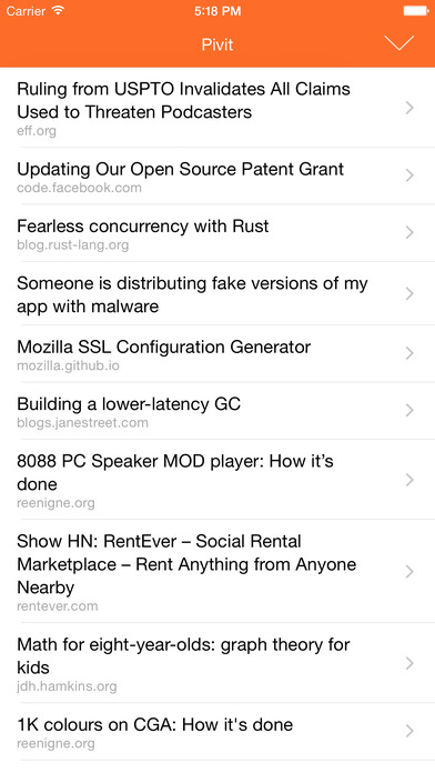
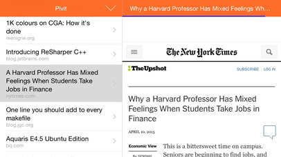
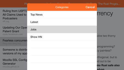
Using the same tech developed for Redeye and Cufflink Browser, Pivit shows you top HN posts and lets you view comments and read entire articles right on your Watch.
Pivit takes a different approach to HN, showing comments first. I built it the way I read HN, as the value to me is in the community. And I often check the comments briefly first to see if an article is actually worth reading, because it filters out the inflammatory or link bait posts. My time is valuable.
That may sound odd, but we're already reading posts on HN that are voted up, so things are already vetted. Why not read into that a bit, and check the comments first?
Let me know what you think.
Using background refresh, posts will always be up to date when you open the app--no need to refresh, it's already ready to read. This adapts to your reading patterns--read HN a lot? It'll refresh more often.
Supports Dynamic Type for great fonts at all sizes. Uses the latest WebKit APIS to ensure fast loading of sites.
Reviews
Older version was better
Itsderk
Viewing comments is buggy/impossible (iOS 8.3 iPhones 5S). Lost sorting feature as far as I can tell.
Older version was better
Itsderk
Viewing comments is buggy/impossible (iOS 8.3 iPhones 5S). Lost sorting feature as far as I can tell.
Beautiful, but lacks older article viewing
flavmartins
I love the app. It's by far the best looking Hacker News app available. Especially with iOS7, it seems like more HN apps have yet to adopt the new design. My only disappointment is that the app doesn't refresh to show older articles. I can see the front page or newest articles, but when it get to the end of the list it doesn't refresh and load older articles.
Minimal, clean
ruishigao
I've been trying a lot of the hacker news apps to see if I could find the perfect app for me. Despite the fact that HN is a pretty simple site, most of the apps don't provide a great, smooth experience. This app is good if you like minimalism and use HN primarily to find interesting links. But if you're interested in the discussions/community aspect, like I am, this app falls short big time: 1. The number of comments isn't shown. I like to know immediately what links are getting a lot of discussion. 2. Comment threads are collapsed by default, which is incredibly annoying. 3. The little three dots to show that you can expand a discussion are too subtle. 4. The expansion itself is annoying and distracts me from the actual discussion. If there is a good discussion going on then it should be easy for me to get absorbed and enjoy it. The comment model just wasn't well thought out. If I've navigated to the comment section then I probably WANT to read the comments so adding obstacles to that doesn't make sense. Comments should be expanded by default and then collapsible if the user finds a particular discussion uninteresting.
Great for HN, comments need bit of work
IceCreamMatt
I've been using this as my go to app for HN. The comments section could use some work. Maybe a setting for pre expanded comments and not collapsing them if you accidentally swipe off comments. Otherwise I love it.