Birdie for Twitter
| Category | Price | Seller | Device |
|---|---|---|---|
| News | Free | Mailr Tech LLP | iPhone, iPad, iPod |
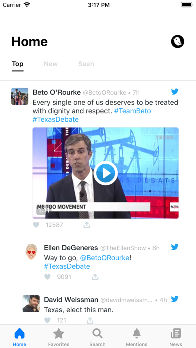
Unlike Twitter, Birdie shows the best and most important Tweets first. This means that you never miss what's worth reading, even if you have limited time. Tweets that are already read are automatically moved to the 'Seen' section, allowing you to focus on what's new!
*No Bots*
In addition to highlighting the best Tweets, Birdie also surfaces the best replies. This means you don't have to scan through the noise and low-quality bot Tweets in order to find interesting exchanges. This makes your Twitter experience much calmer and higher-quality!
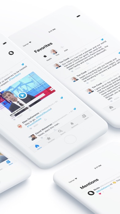
*Favorites*
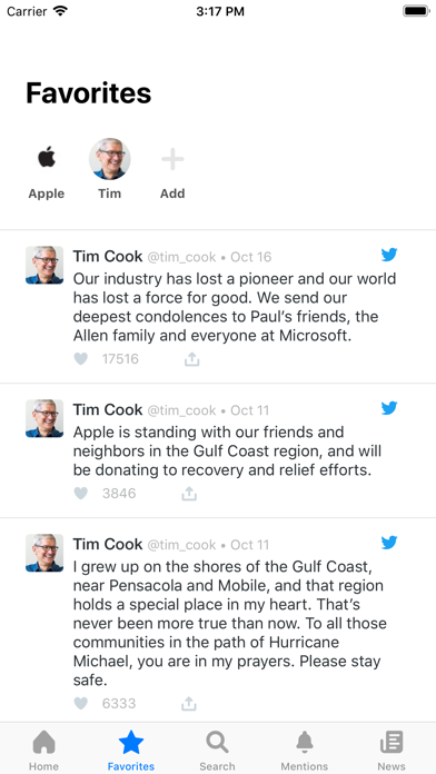
Birdie lets you focus on the most interesting people in the 'Favorites' section. Think of it as your iPhone's VIP contacts, or the people on speed-dial. Always easy to access with a single tap!
*Personalized Trends*
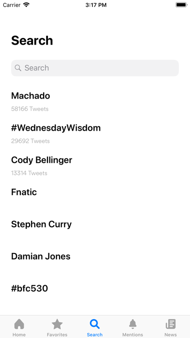
Ever wonder why something you have no interest in keeps popping up in Twitter's trends? With Birdie, you don't have to! Birdie automatically finds what's trending amongst the people you follow and interact with and highlights that first!
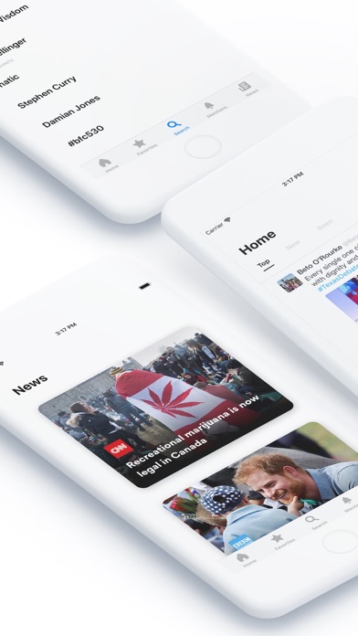
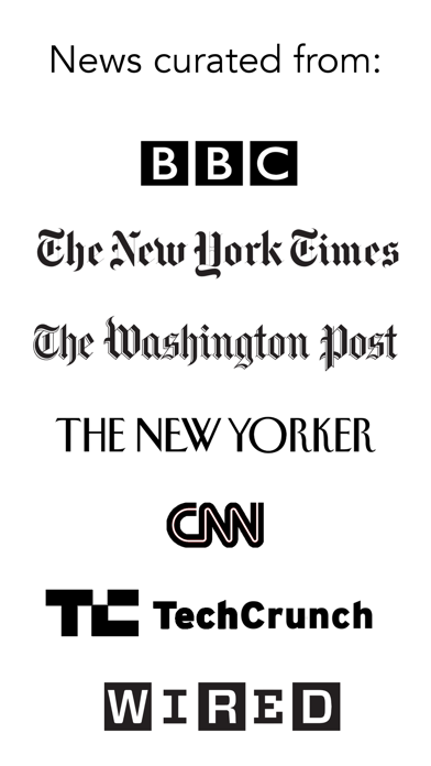
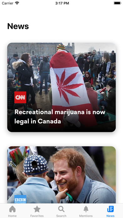
*The Best News*
Birdie highlights the best news articles from your timeline that match your interests. You can focus on reading news right in Birdie's distraction-free news section, which means you don't have to hop between Twitter and some other news app!
Reviews
Don't like the automatic list generated
Notapaidreviewer
It has it’s pros and cons. Arguably the second best Twitter app for the IPhone. But that doesn't say much since most are bad.
Excellent!! Worth a download.
MDeter67
Thanks for making an easy way to gather news on twitter!! I can find the real stories that matter and I can keep up with what’s going on around the country. I also love that I can choose my own sources.
No more floating buttons please
SwaggerHacker
I love the app, but I really really really wish there wasn't a floating tweet button. It's one of my biggest gripes about the actual twitter app
Why the useless top, new , seen & even the bigger header Home eating essential top space.
GeenLawang&1
I would’ve given 4 starts but on the main user interface the most essential screen area is eaten by the useless buttons of top, new, seen and a bigger header “Home”. Why do we need these buttons and why would you destroy a beautiful and clean interface with these?
Good app but one gripe
CrisGal
If I tap on a tweet to view it or its replies/conversation, in the top left corner of the app I’ll see an arrow and the word “button” on top of the arrow. It’s such a beautiful app overall, but this is distracting and ugly. I don’t use Birdie that much anymore because of this.
Great app, needs an update to fix bugs
ThanksAlot!!!
I like this app more than the official twitter app. Only thing is it need a bit more polishing and it’ll be my go to app. Also the news section is way better than twitters.
Birdie makes Twitter great again
flappybirdsatonawall
This really is an amazing app - it takes the best of Twitter and presents it beautifully. The fact that it collects interesting news articles from your timeline is a nice plus. This is what twitter should be - simple and impactful, minus the trolls and bots.
Awesome!
ThatOneJoJo
I really love the whole design! I do wish that photos could be viewed on tap and that certain links wouldn't just show up as links, but overall amazing job!